
How to give website design feedback that doesn’t suck
If you need to give effective website design feedback, look no further. This guide will get your design review process running like a well-oiled machine.
If you don’t know what you’re doing, giving website design feedback — and keeping the whole process under control — can be nightmare-inducing for everyone involved.
Getting your site’s design right is absolutely critical to making the right impression. Good web design signals credibility and fosters trust, while crappy design and bad UX make users jump ship before your site is even done loading (especially if it takes longer than 2-3 seconds to load). And speaking of trust, did you know that when judging a site’s credibility, 46% of consumers pay more attention to the visual elements than the actual content? If you're seeking expert design services, consider exploring the capabilities of the ARCC web design company.
The sad truth is that people definitely do judge a book — ahem, website — by its cover. And they do it fast. Studies have found that it only takes 50 milliseconds (or 0.05 seconds) for users to form an opinion about your website.
When you consider how many platforms actively encourage us to make value judgments and snap decisions solely based on aesthetics (looking at you, Tinder and TikTok), it seems likely that the margin of opportunity to make that vital first impression is getting even smaller.
What does all this mean for you?
In short, you’d better make damned sure your website looks great and performs well.
From color-coded spreadsheets to essay-length feedback comments, to endless emails and messily-annotated screenshots, to multiple content assets names Real_Final_FINAL_version, to relentless Slack notifications at all hours — there has to be a better way.
There is.
In this guide, you’ll learn how to facilitate and provide effective website design feedback, whether you’re a total noob giving cross-functional feedback, a designer reviewing another designer’s work, or a business leader who needs help giving design feedback.
Keep reading to learn how to create a quality final product without traumatizing your designer(s) or getting blacklisted by the web design agency you outsourced to.
Here’s what we’ll cover:
- Where design feedback fits into the larger web design process,
- Why giving good web design feedback is important
- Best practices for providing website design feedback, and
- How to give efficient web design feedback.
Let’s dive in!
The website design process
Before we get into the weeds of giving effective website design feedback, let’s zoom out for some context and look at where design feedback fits into the greater web design process.
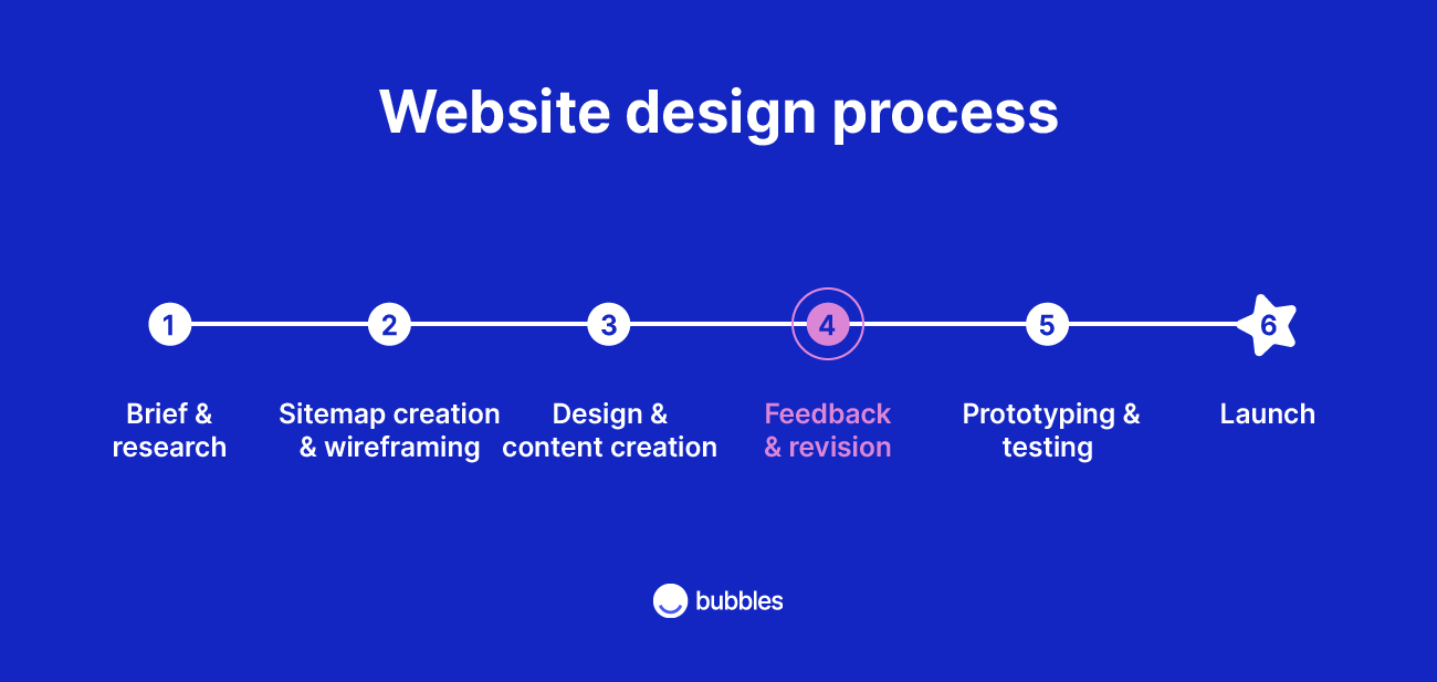
As you can see in the image above, there are a lot of steps involved in building a website, and some steps — such as user research, design feedback, content creation, and user testing — might repeat several times before the site is finalized.
Before you start doling out feedback, it’s useful to understand what’s involved in the other stages, so you can give informed direction and don’t end up with your foot in your mouth.
Below, we’ve given a brief overview of each step in the website design process.
1. Brief, research, and ideation
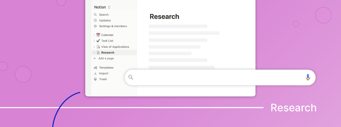
Before designing a website (or app), there’s an ideation and research phase in which stakeholders establish the website’s “big idea” and define the brief or design problem.
During this phase, the team will outline the website’s intended functions and target audience. Next, they’ll conduct user research to understand how the website’s user interface (UI) and user experience (UX) design can best address the intended user’s needs.
For more info on this, check out this nifty guide to UX design research from Think with Google.
2. Sitemap creation and wireframing
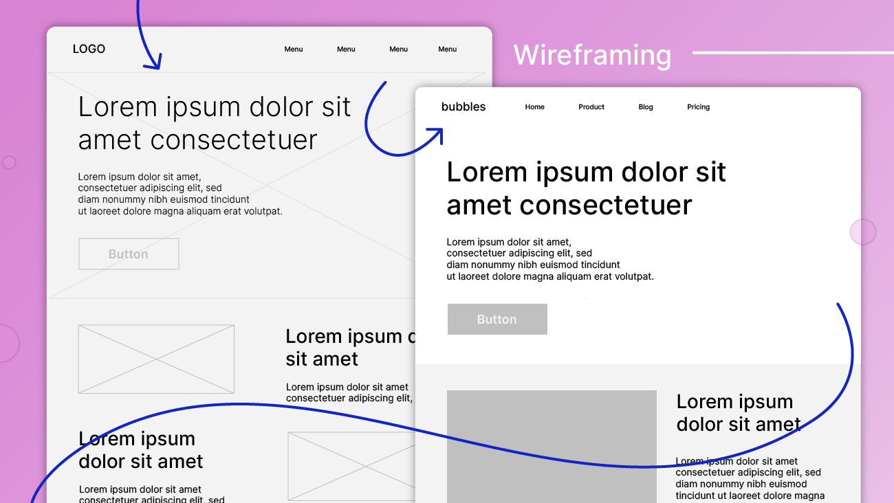
The next step is to create a sitemap — basically a blueprint of the site’s main web pages, functionality, and navigation — and wireframe.
The wireframe acts as a foundation on which designers can frame out the site’s visual elements, including page layouts and sections, as well as elements like headers and footers.
As shown in the image below, wireframes can be low-fidelity or high-fidelity, referring to their degree of detail or “finished-ness.”
3. Design mockup and content creation
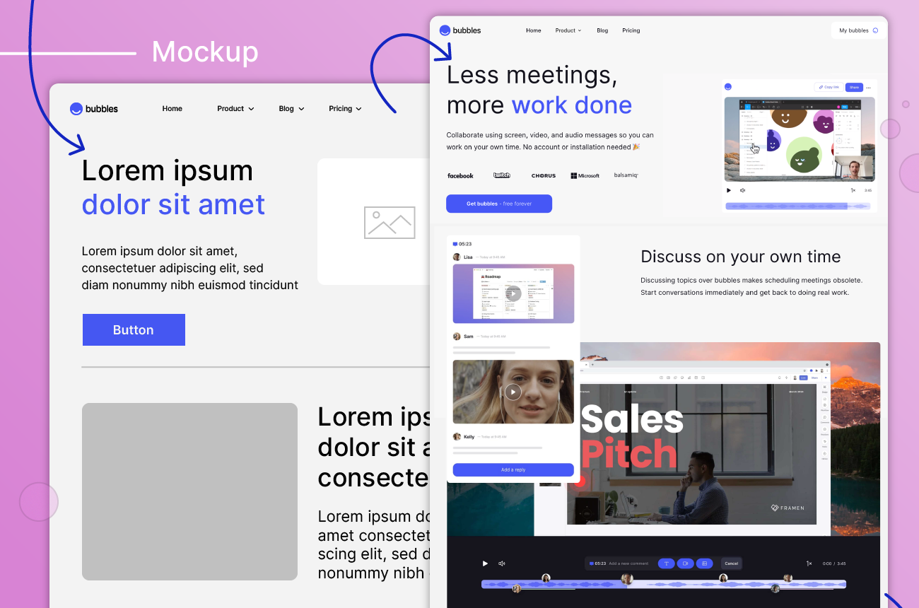
With the wireframes in place, your designer(s) can start designing and content creators can get start churning out lovingly crafting your site’s copy and making the beautiful photos, illustrations, animations, videos, and other digital assets that will live on your site.
Your designer will use their expertise to decide how best to apply your branding and styling to the site’s content using elements like logos, color palettes, typography (fonts, sizing, line spacing, padding, etc.), spacing, imagery, and other visual elements.
Their first goal is to define the website’s overall look and feel. Once this is approved, they’ll further hone and fine-tune the details.
The designer will often use content placeholders in sections that will be created by other team members, e.g. use lorem ipsum text where the copywriter needs to work their magic and place stock photos where the brand’s photos will go (once that damned photographer sends over those edited images!).
As with wireframes, design mockups can be low- or high-fidelity, as seen below.
If you’re using a CMS platform — like WordPress, Wix, Squarespace, or Shopify — your site designer might stage your mockups in the CMS itself instead of using a tool like Sketch, Figma, Photoshop, or InVision. But don’t worry, nobody will be able to see the site until it’s published.
4. Design and content review and feedback
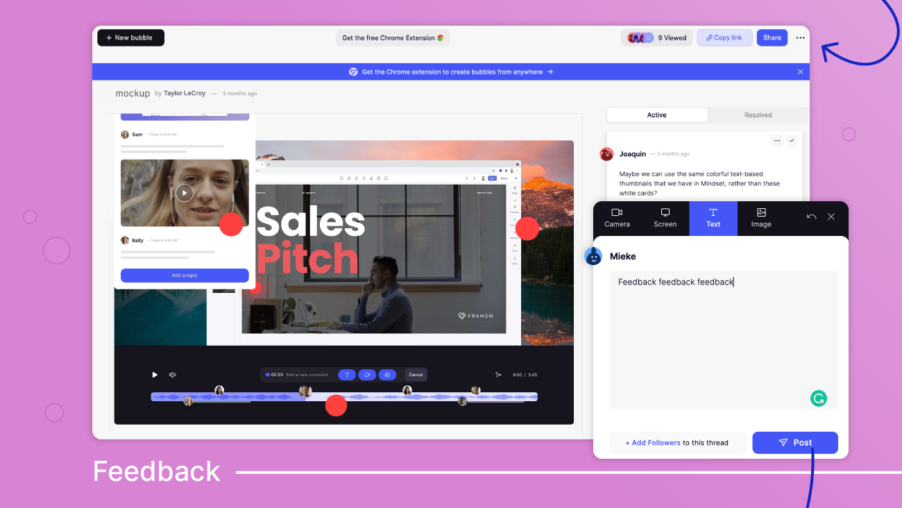
This is the stage where stakeholders (like you!) get a chance to weigh in and provide constructive feedback on the website’s look and feel and help fine-tune the content that will populate the site.
Most website designs and content will go through several rounds of feedback and revisions, (hopefully) improving and getting closer to final approval with each iteration.
5. Prototyping, testing, and redesign
The prototyping stage involves turning the mockup and content into an interactive, high-fidelity model of the website.
While this is typically not the final website, the prototype showcases the final website’s look and behavior as far as possible before the final custom coding is done.
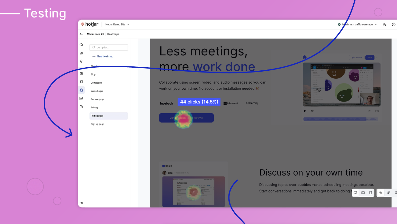
The prototype is used to conduct user testing and gather data and feedback about the site’s usability using tools like attention heatmaps and surveys.
Sometimes usability testing leads to partial redesigns and additional review and testing cycles to make sure the user experience is as good as it can get.
There are a number of great tools for recruiting usability testers.
Once the prototype is approved, the website’s design is finally handed over to a web development team that programs the website and prepares it for launch. Of course, if you’re using a content management system (CMS) with a visual website builder with drag-and-drop editing, you might not need much (or any) coding at all.
6. Website launch
If you’ve made it this far, congratulations!
Your site is ready to go live, which means it’s time to party. Or run your launch campaign or whatever. Or both?
Definitely both.

What can go wrong? Why good web design feedback matters
Effective website design feedback matters. Don’t believe me? Here’s what getting it wrong — giving crappy feedback, or giving great feedback in a crappy way — can look like:
- Your feedback gets “lost” and never gets addressed
- Your feedback is unclear and the designer doesn’t understand you, causing them to go off track and get it totally wrong
- A lot of back-and-forth ensues
- Everyone is frustrated, crying as they burn the midnight oil
- Someone threatens to quit
- Your launch date gets pushed back (untold opportunity cost)
Website design feedback tips and best practices

Follow these tips to give better web design feedback.
1. Do your homework
Get to know the basics of UI and UX design. Reading this blog is a good first step.
You obviously don’t need to become a web design expert, but understanding the basics and being conversational in the language of web design will make giving feedback a lot easier.
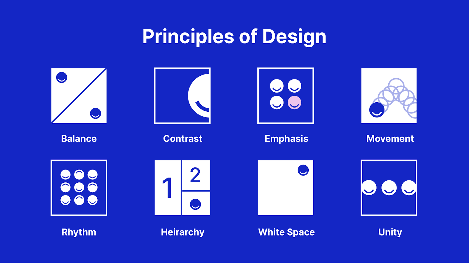
Having a basic understanding of the main principles of design will help you differentiate what constitutes good web design in the first place. These design principles are a set of guidelines or considerations that modern designers keep in mind to create products that promote both usability and aesthetic appeal.
Google’s Material Design guidelines are a great resource if you want to dive deep down this rabbit hole and learn about the latest industry best practices.
2. Be curious and ask questions
Be curious about the designer’s perspective and choices as a way to understand why they made the decisions they did. There are probably good reasons behind each design choice, even if they’re not immediately clear to you.
Ask your designer to explain their rationale and discuss the merits of any design decisions you don’t love. This should help you figure out whether the thing you dislike is a matter of subjective taste or a legitimate issue that needs to be fixed.
3. Start by looking at the big picture before getting into the details
Before you start giving detailed feedback on every line, color, and shadow, zoom out and look at the big picture. That means the layout and overall look and feel. It doesn’t help to start fixing the little things if the big picture might still change.
The specific content like copy and photos can all be swapped out later (and many of them might, in fact, be placeholders at this point), so start by focusing on where the words and photos are on the page and whether they work together as a whole.
4. Explain the problem but don’t prescribe the solution
Trust your designer’s expertise. Explain the issue but don’t tell them how to do their job. Unless you’re a seasoned web designer yourself, the odds are, your designer knows best.
If you’re struggling to put your finger on precisely what’s wrong, describe what you’re feeling to give the designer a sense of what needs to change. Ultimately, design is about impacting the user’s emotions, and if the design isn’t evoking the right mood, the designer should be able to change that by tweaking elements like fonts, colors, and photos, or adding more white space.
If the design really doesn’t live up to your expectations, it can be helpful to give the designer visual feedback by showing them examples of the effect or style you had in mind. Behance, Awwwards, Dribbble, and Pinterest are good places to look for inspiration, and don’t neglect to look at other websites — both in and beyond your industry — to get a feel for what you like and dislike.
5. Be clear, concise, and specific
The more clearly you can express your feedback, the better your designer will be able to address your feedback and make the changes you envision.
Think about what you’re trying to convey with your feedback before you start so you can keep it as short and to the point as possible. Avoid writing essay-length comments.
Whenever possible, give feedback in context by annotating your feedback to the design element you’re referring to. This allows you to be clear and specific and reach pixel-prefect alignment.
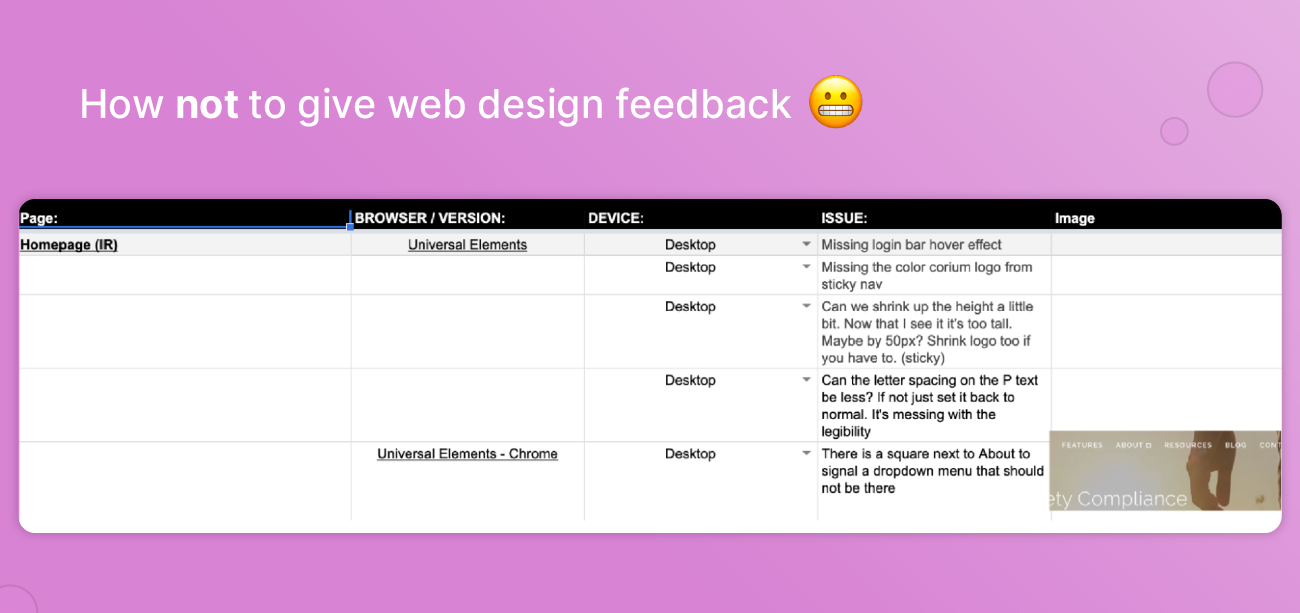
A lot of organizations still rely on Google Sheets for feedback, but this can create chaos when every team member uses different naming conventions or even document versions. Besides, the feedback is far removed from the context, which makes it difficult to be clear and concise and leads to a lot of back and forth.
6. Record your feedback in the right place
Using the right tools can make giving good web design feedback so much easier.
As a designer, it can be hard to keep track of which feedback is about which aspect of which part of which design, especially when the feedback is delivered in a medium that’s far removed from the actual design.
Feedback given in meetings easily gets lost in translation. Getting feedback via dozens (or hundreds) of emails, calls, and Slack messages, requires a lot of detective work to connect the dots. Not to mention all of that task-switching is not great for getting deep, focused creative work done.
To avoid these frustrations, attach your feedback to the design itself so that it’s immediately clear what you’re talking about. Take a screenshot and annotate your comments to that.
That way, everything’s in one place, and if anything’s unclear, your collaborators can add their comments or questions to the same thread. Now that’s contextual feedback.
How to give efficient web design feedback: Use bubbles
With a tool like bubbles, you can make giving feedback a much more efficient and pleasant experience for everyone involved.
Most of the web design review tools in use today rely on capturing screenshots and adding annotations. While this is a huge improvement from giving design feedback in Google Sheets, it still leaves a lot to be desired, especially for remote and asynchronous teams.
When each reviewer is taking their own screenshots and giving feedback in isolation, the designer will often get the same feedback multiple times — or worse, get conflicting feedback about the same thing and then have to go back and forth trying to get everyone aligned. It’s not a very efficient way of doing things and wastes a lot of the designer’s precious time.
Even dedicated web design review tools like InVision are severely lacking when it comes to collaboration.
The best way to give web design feedback is by using a website feedback tool that combines the collaborative potential of meeting in person with the convenience of asynchronous communication while collating everyone’s feedback in one place.
Below, we’ve outlined how to use bubbles to streamline your web design feedback workflows in four simple steps.
Step 1: Take a screenshot and annotate your feedback
To do so, simply go to the bubbles website and hit “Get bubbles” or install the free Chrome extension and click the bubble icon to open a new bubble.
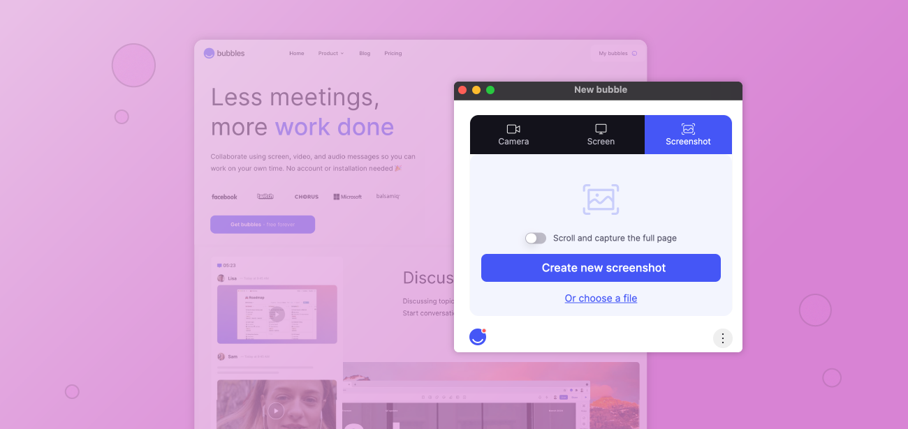
Bubbles’ simple user interface makes it quick and easy to get started.
Next, you’ll select “Screenshot,” and choose whether you want to create a new screenshot or select a file to annotate using bubbles. You can also toggle “scroll to select the full page” (note this functionality is currently only available when using the extension).
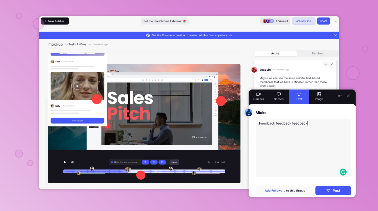
With bubbles, you can capture static screenshots or scroll to capture entire pages and annotate feedback to specific design elements.
Bam! Screenshot captured. Now you can click anywhere on the screenshot to create a red dot (or bubble) and leave contextualized feedback to show exactly what you mean.
You can comment using text, video, or attach an image. Or, if you want to share a reference to something you liked on another website, you can leave a comment in which you share your screen.

Bubbles lets you give in-context feedback in whatever way helps you get your point across clearly.
Step 2: Share your annotated screenshot
To share your screenshot with the designer (and/or with the rest of the team to collate their feedback in the same location), simply share the link to the bubble with all the relevant stakeholders to review.
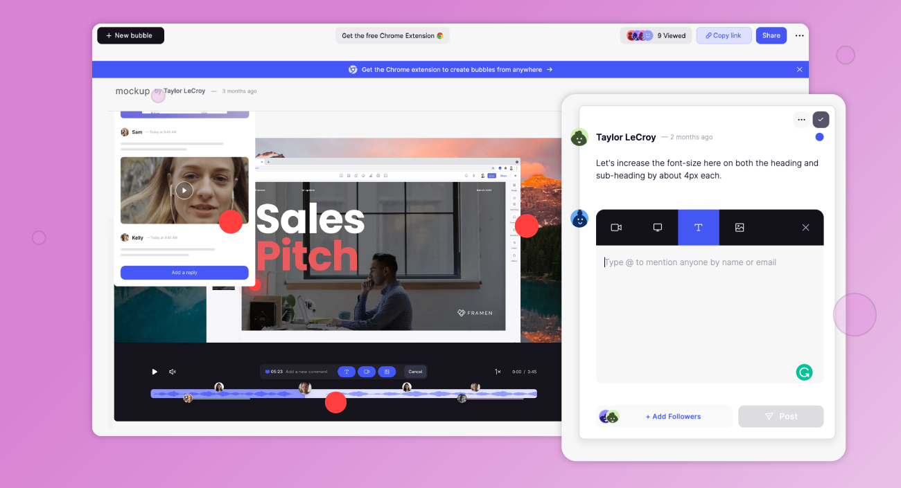
With comment threading and @mentions, Bubbles makes giving pixel-perfect website design feedback a collaborative process.
Step three: Other reviewers add their feedback
Each reviewer views the bubble by clicking on the link (they don’t even need to create an account first!) and gives their input by annotating their comments to the screenshot.
Other reviewers can add their own feedback to the same screenshot, interact with your feedback by clicking the dots, or browse through and click on your markup to see which dot each comment refers to.
This makes it possible for project teams to have asynchronous discussions and solve problems in context, no matter where they’re located or what timezone they’re in.
Step four: The designer responds to feedback and resolves action items
The designer can review everyone’s feedback in one place and respond to input and questions. Once consensus is reached on any contentious points, they can go ahead and apply changes to the design.
They can also toggle between “Active” and “Resolved” comments and mark them as resolved as they go, or @mention collaborators to ask for additional information.
Using bubbles’ free screen recording tool, the designer can also facilitate a design review of the website design.
One design feedback tool to rule them all
Bubbles is a must-have tool for collaborative, contextualized two-way feedback.
Whether you work in an office or a geographically-dispersed remote team, working asynchronously is better for minimizing interruptions and getting deep, focused work done — and bubbles is the async collaboration tool you didn’t even know you were missing.
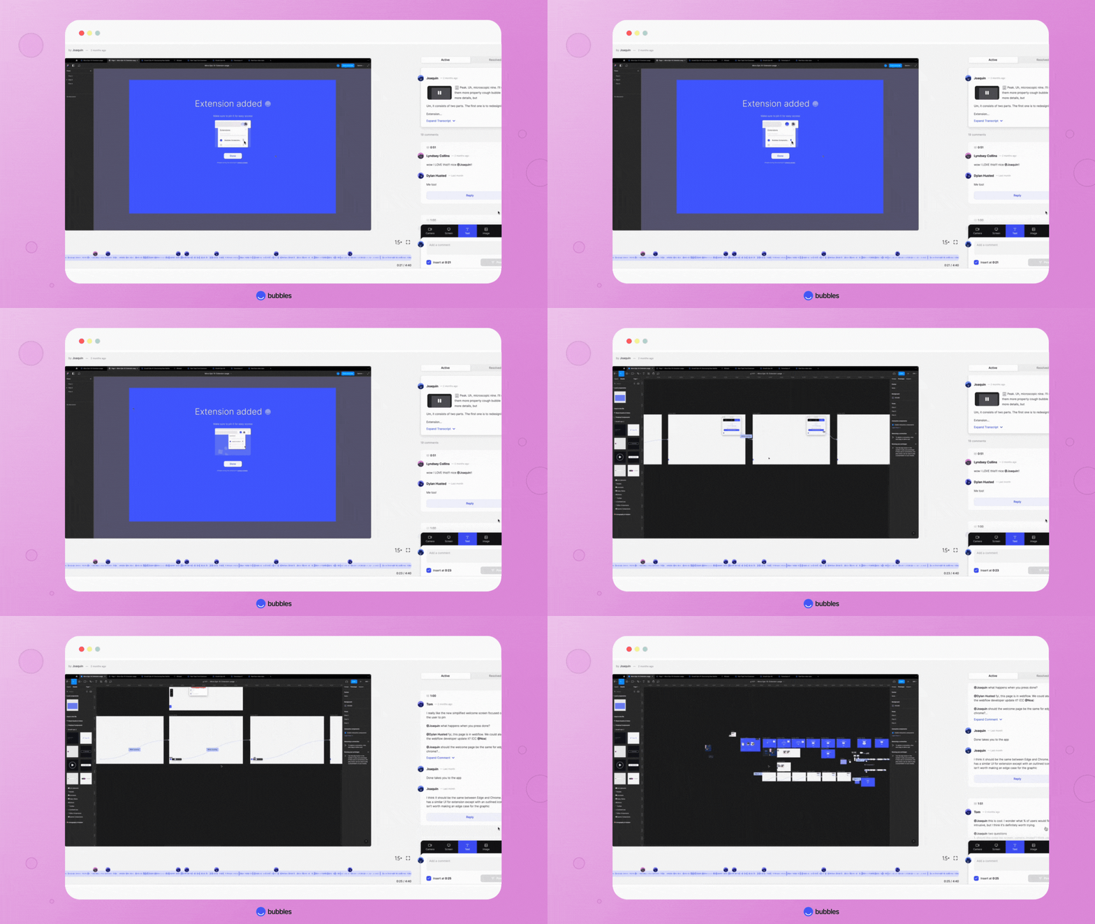
In this GIF, you can see bubbles being used to run a website design review. Note the little bubble icons on the playback bar showing annotated comments.
No more info silos, duplicate feedback, or document version control shi*tshows.
No more meetings where half of the actual decision-makers can’t attend.
No more wondering “What the hell are they talking about?”
No more half-arsed, unthought-out feedback.
Just real, creative collaboration.
Sign up for bubbles in seconds and start giving your team more effective and meaningful website design feedback.
Make your
meetings matter
Loved and trusted by 100,000+ users:
- Automatically Record and Transcribe Meetings
- Extremely Accurate Notes, Summaries, and Action Items powered by AI
- Works with Zoom, Google Meet, and Microsoft Teams
- Save time and follow-up with quick async videos
Simply connect your work Google or Microsoft Calendar to get started.
Collaborate better with your team
Get your point across using screen, video, and audio messages. Bubbles is free, and offers unlimited recordings with a click of a button.
.png)
Collaborate better with your team
Get your point across using screen, video, and audio messages. Bubbles is free, and offers unlimited recordings with a click of a button.
.png)


